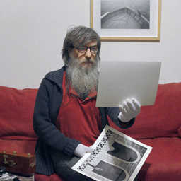
One funny aspect that only I would notice on this photo, is that it is flipped due to how I scan with the emulsion side up
That's interesting, never seen the characteristic curve of Harman Phoenix II Before...
That crossover that happens with the dyes at the mid point might explain why different lighting generates different "uncorrectable" casts? Definitely not linear, and it can be visualized, as I said, highly unpredictable film, not my cup of tea.
About the Super Electric Blue, as Roberto mentions
I wouldn't go to such extremes to edit this photo, selecting the blue sky, to put a mask and reduce stuff etc, instead I would rather go for a film stock that gives me closer to what I like in terms of overall pallete and feel. Definitely not this one! Portra 160 is lovely however! I have some photos I like much better the rendition with it