The negative
What I am showing here is not linear, but rather gamma encoded for display, on a light table the negative would look like this.
This is a pretty dense neg. Lots of scene flare, the skylight is nuclear, and the statue sits in a deep well of mid-dark tones.
The murky world a “flip” gives you is hardly worth mailing home about:
A recognizable picture, yes, but it’s dull and mushy. This isn’t a density-correct inversion; it’s just a histogram flip like it gets employed in countless tools.
The tones are wrong and no amount of levels fiddling fixes the structure or the light relationships of the original scene. There is a sun outside!
Proper density inversion — but the light is still off the scale
With ColorNeg’s proper inversion the tones land where they should, Virtual Grades help yet the dome light is still brutal and the midtones feel thin.
Filmic Relight to the rescue!
One pass of Filmic Relight brings it together: the highlight roll-off becomes civilized, midtones gain shape, shadows stay readable, and the statue steps forward in a wonderful way.
What Filmic Relight is (for B&W):
Filmic Relight performs a pixel-wise reinterpretation of the scene’s light to achieve a filmic rendering style. This is not a traditional contrast curve or exposure change. An elaborate tone curve is applied to the underlying lightness of the image. While “filmic” is not a property of any actual paper or emulsion, it reflects an audience expectation shaped by how motion pictures were historically produced: captured on negative film and creatively shaped for projection on positive stock. This visual language includes structured shadows with visible depth, rich midtones, smooth highlight roll-off, and a natural handling of brightness that avoids harsh clipping.
The Strength slider controls how much of the Filmic Relight effect is applied. At 0%, the image remains unchanged. At 100%, the full reinterpretation is used. Intermediate values blend the original with the relighted version. Negative Strength values weight the effect into darker areas, tapering it through the midtones and leaving the brightest areas less affected. This allows you to relight shadows and midtones while leaving highlights largely untouched.
Reminder: By posting here you’re sharing your raw images / linear Tiff files and derivatives for others to
download, edit, and re-post inside the forum.
Christoph Oldendorf / C F Systems may use originals and derivatives for demos, docs, and marketing
of ColorPerfect.
Outside use by other users requires your explicit permission or a license you add.
Make sure you own the photo and have consent if people are shown.
A quick, single-tool demo from CP3 for saving your bacon with super dense B&W frames
-
C.Oldendorf
- Developer
- Posts: 212
- Joined: Fri Sep 02, 2022 10:31 am
- Contact:
- Attachments
-
- N-79-26.tif
- (55.36 MiB) Downloaded 6 times
This is impressive, to my eyes it's taken on a different approach and has expanded the workflow when dealing with difficult dense negatives.
I would be interested to read the steps you took to get to the point you described as "Proper density inversion" before moving onto the Relight adjustment
I would be interested to read the steps you took to get to the point you described as "Proper density inversion" before moving onto the Relight adjustment
-
C.Oldendorf
- Developer
- Posts: 212
- Joined: Fri Sep 02, 2022 10:31 am
- Contact:
I may not recall but the good thing is that I can just make another and post a *.cpmetan file for you to load and see the exact stuff I did... I'll do that later.ianb wrote: Tue Sep 09, 2025 12:05 pm I would be interested to read the steps you took to get to the point you described as "Proper density inversion" before moving onto the Relight adjustment
What I meant by Proper density inversion really is the density (film) back to intensity (scene) transfer that film based photography is all about and that before ColorNeg no digital tool did. 20 years down the road I did not check, Dave's foundational math was publicly puplished all this time after all.
-
robyferrero
- ColorPerfect User
- Posts: 175
- Joined: Wed Aug 20, 2025 4:12 pm
- Location: Italia
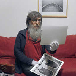
I haven't been able to do more than this.
For my abilities, it's quite satisfactory.
For my abilities, it's quite satisfactory.
- Attachments
-
-
- N-79-26-ColorNEG-E.jpg (146.01 KiB) Viewed 1051 times
- [Full image link - opens in new tab]
-
-
C.Oldendorf
- Developer
- Posts: 212
- Joined: Fri Sep 02, 2022 10:31 am
- Contact:
Roberto that is totally the way to go. I guess what can still be learned from the below is how you can make images brighter than the built in limit 
Without the *.CPMetaN file:
The implications of the why I did that on the current version are discussed elsewhere.
Without the *.CPMetaN file:
- I set Virtual Gradation to 0 {Push 2}
- 00 would lead to flatter mid tones
- I could have done this with Gamma
- but I prefer my known markers
- I ran down BP Tails
- until Shadow clipping was 0.05
- I set Filmic Relight to 100
- I ran up the Black slider all the way to -4.00
- I used Shift + CC Ref to set a new 0.0
- I removed 1EV more, 5EV total
- Zones:
- let 80 stay 80 (just lock)
- let 110 be 100
- let 26 be 20
- Highlight Compression: 1.25/240
- I set Graded White to -0.08
- that is a processing order thing
- can't be done in one go, so TouchUp
- I used Shadow Compression of 6
The implications of the why I did that on the current version are discussed elsewhere.
- Attachments
-
- N-79-26.CPMetaT
- (2.93 KiB) Downloaded 95 times
-
- N-79-26.CPMetaN
- (3.36 KiB) Downloaded 96 times
I must be missing something here, how do you bring in the *.CPMetaN file
-
C.Oldendorf
- Developer
- Posts: 212
- Joined: Fri Sep 02, 2022 10:31 am
- Contact:
With Meta and Pro versions that is now on the Start panel. Tick "Show Meta" and from there you'll see it.ianb wrote: Tue Sep 09, 2025 3:41 pm I must be missing something here, how do you bring in the *.CPMetaN file
The mechanism is the same as with restoring from the last session, so including my BPoint you'll want "Exact".
- Attachments
-
-
- meta_files.jpg (81.7 KiB) Viewed 1030 times
- [Full image link - opens in new tab]
-
-
robyferrero
- ColorPerfect User
- Posts: 175
- Joined: Wed Aug 20, 2025 4:12 pm
- Location: Italia
It's not easy; I have to understand, know, a priori, how the tools work exactly, when to use them, and why to use them.
Put like that, it seems perfectly normal, but imagining a priori that, for example, FilmicRelight needs to be set directly to +100 to close the highlights, when instead you can restore the highlights with the specific slider, makes it difficult to choose one option over the other. Obviously, the highlights must then be restored anyway with the recovery slider, but personally, I would have FilmicRelight work on the shadows, around -8, as I actually did in the example shown.
And I can imagine that many users, in this case, would have preferred to manage the shadow, since it's so dense.
Let's not even discuss virtual gradation at 0, 00, Shift + CC to set a new 0; it's not easy
Even TouchUp is needed to make such minimal changes, which can't be done in ColorNEG. It takes experience.
In any case, first of all, I wanted to try and continue working on the values obtained with the first example.
The result is improved; the image has more volume, there's more contrast, perhaps a little too much, because—I don't know if I did it right—I tried to maintain a dense black point, not very dense, but dense.
Good or bad, I like it; I won't deny that I had to work with tricks. By now, my file was going in that direction, so in terms of contrast, highlights, and shadows, it wasn't all coherent, linear, and progressive, so I worked on a couple of different files and merged them with masks.
The photo is beautiful, but to be effective, it needs to have the right atmosphere. Yours has the right atmosphere, mine is a little less so.
But I did my best to adapt it, but if I don't care about your atmosphere, mine might be fine.
- Attachments
-
-
- N-79-26-ColorNEG-version_2-E.jpg (136.73 KiB) Viewed 1002 times
- [Full image link - opens in new tab]
-
What a nice shot, I hope to not deserve it.